
Washington Redtails – Brand Identity Redesign
This rebrand concept transforms the Washington Commanders into the Washington Redtails, a respectful and modern homage that brings back elements of the team’s Native American influence without reverting to the retired name.
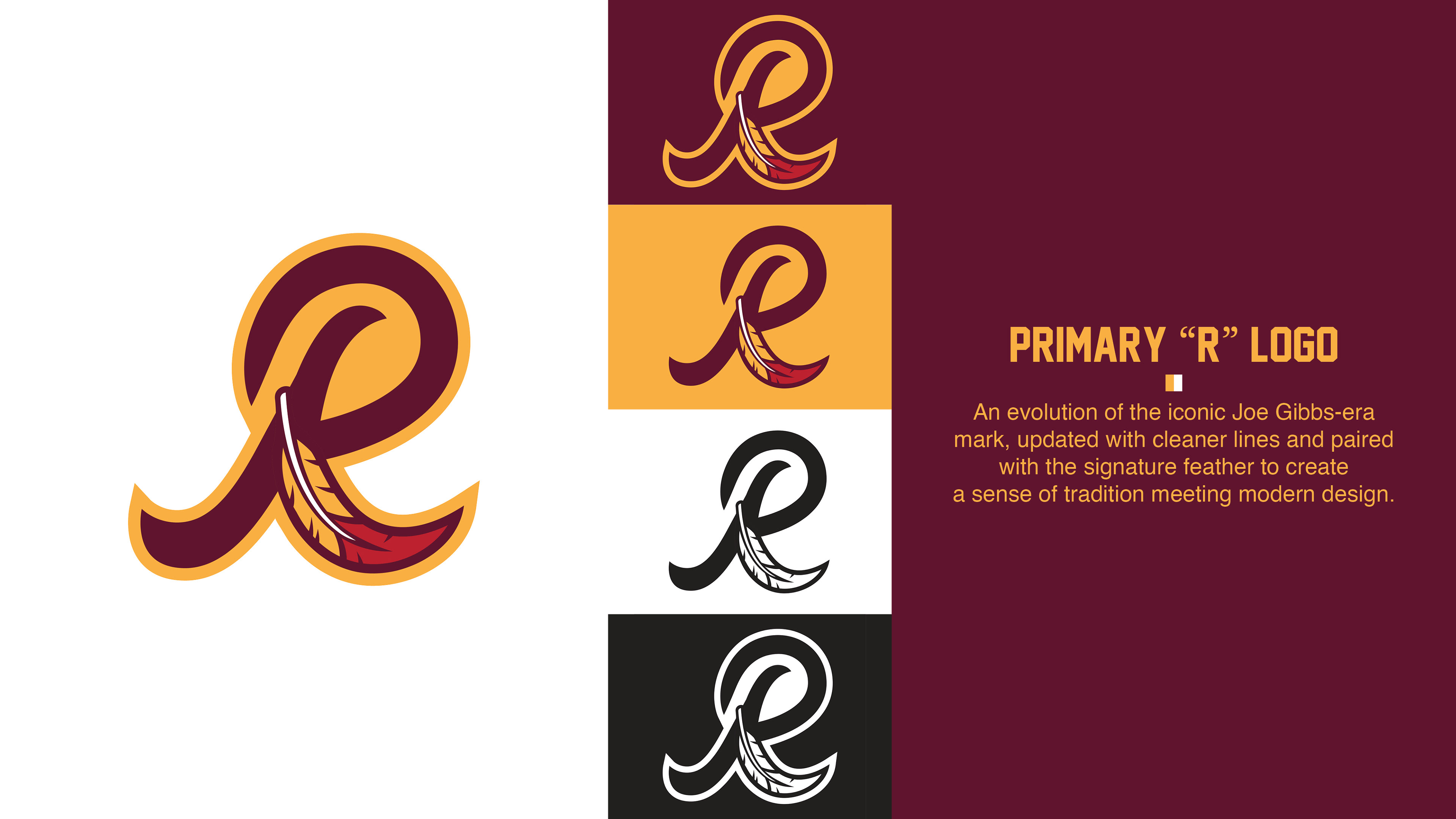
The name Redtails draws inspiration from the distinctive feather with a bold red tip — a unifying visual motif woven throughout the identity. The primary "R" logo is an evolution of the iconic Joe Gibbs-era mark, updated with cleaner lines and paired with the signature feather to create a sense of tradition meeting modern design.
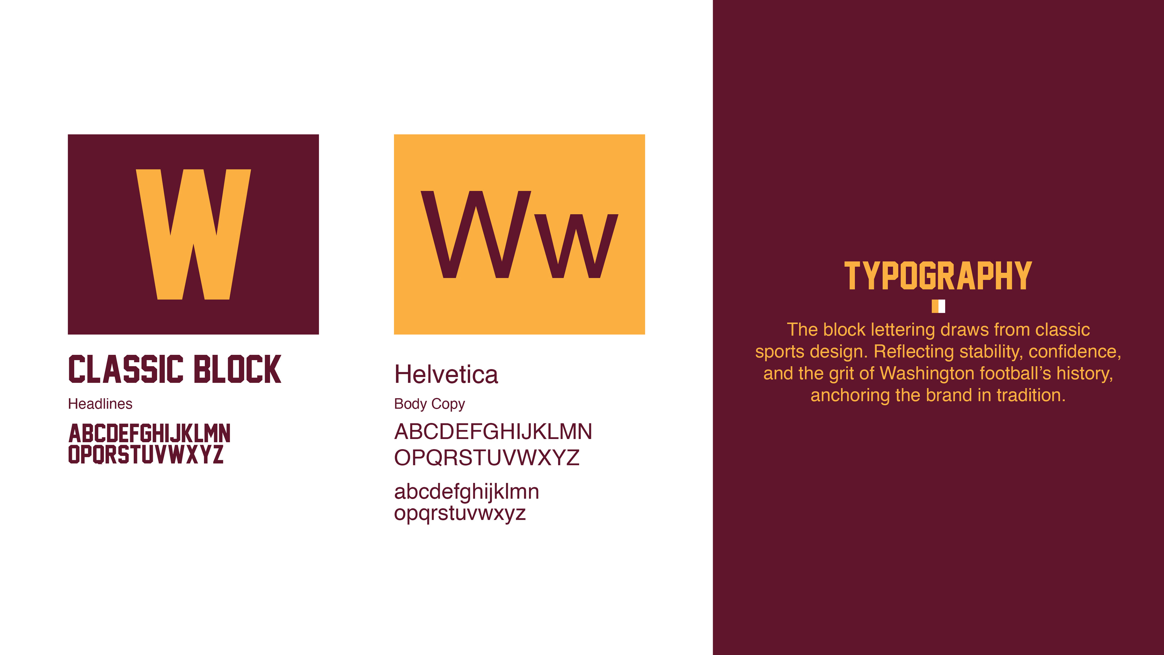
The block lettering used across the identity draws from classic, old-school sports design — bold, clean, and unmistakably strong. This traditional typographic style conveys stability and confidence, while connecting to the grit and toughness of Washington football’s storied past. It serves as a visual anchor, reinforcing heritage while delivering timeless impact.
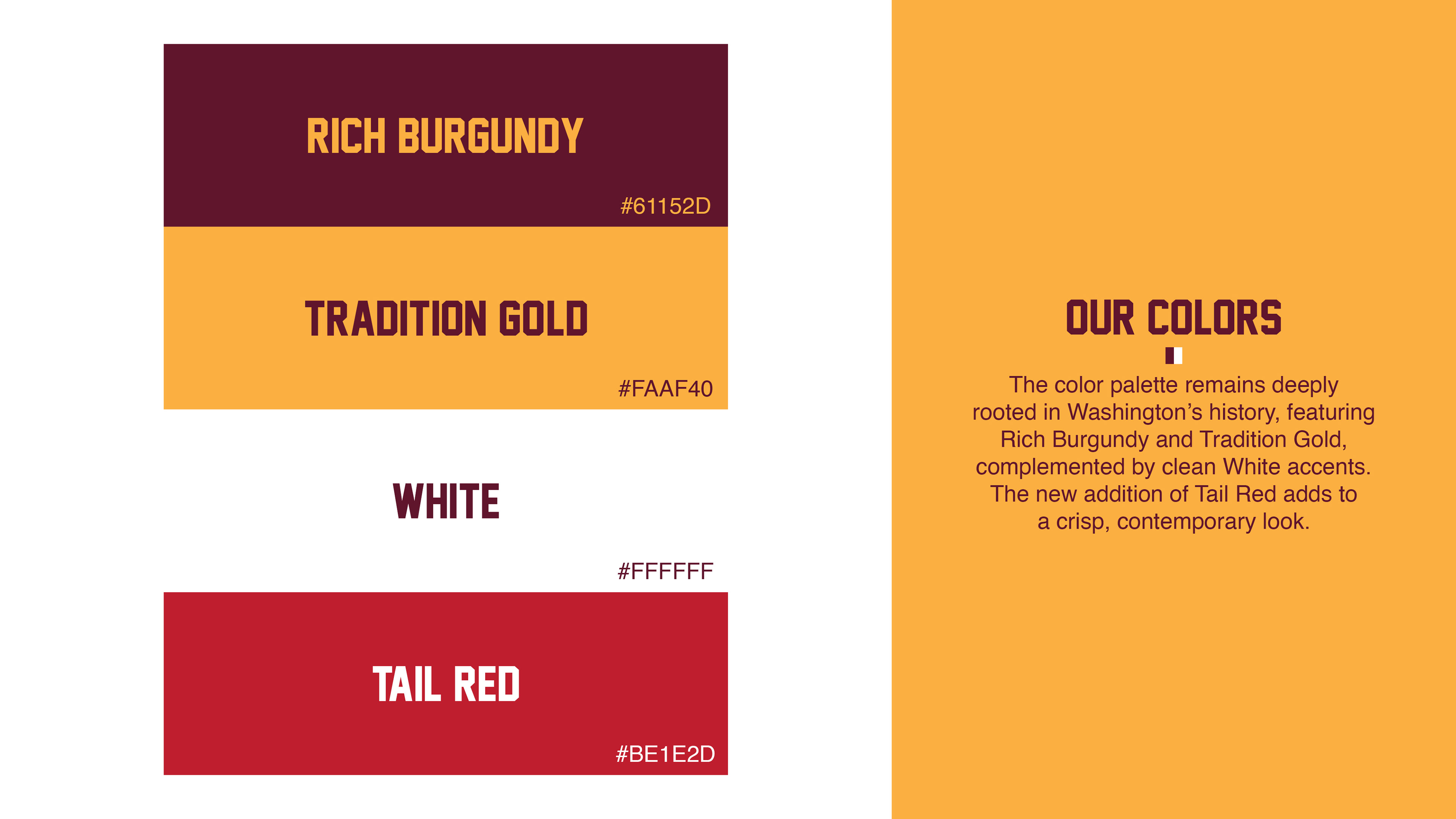
The color palette remains deeply rooted in Washington’s history, featuring rich burgundy and gold, complemented by clean white accents for a crisp, contemporary look. Supporting elements include:
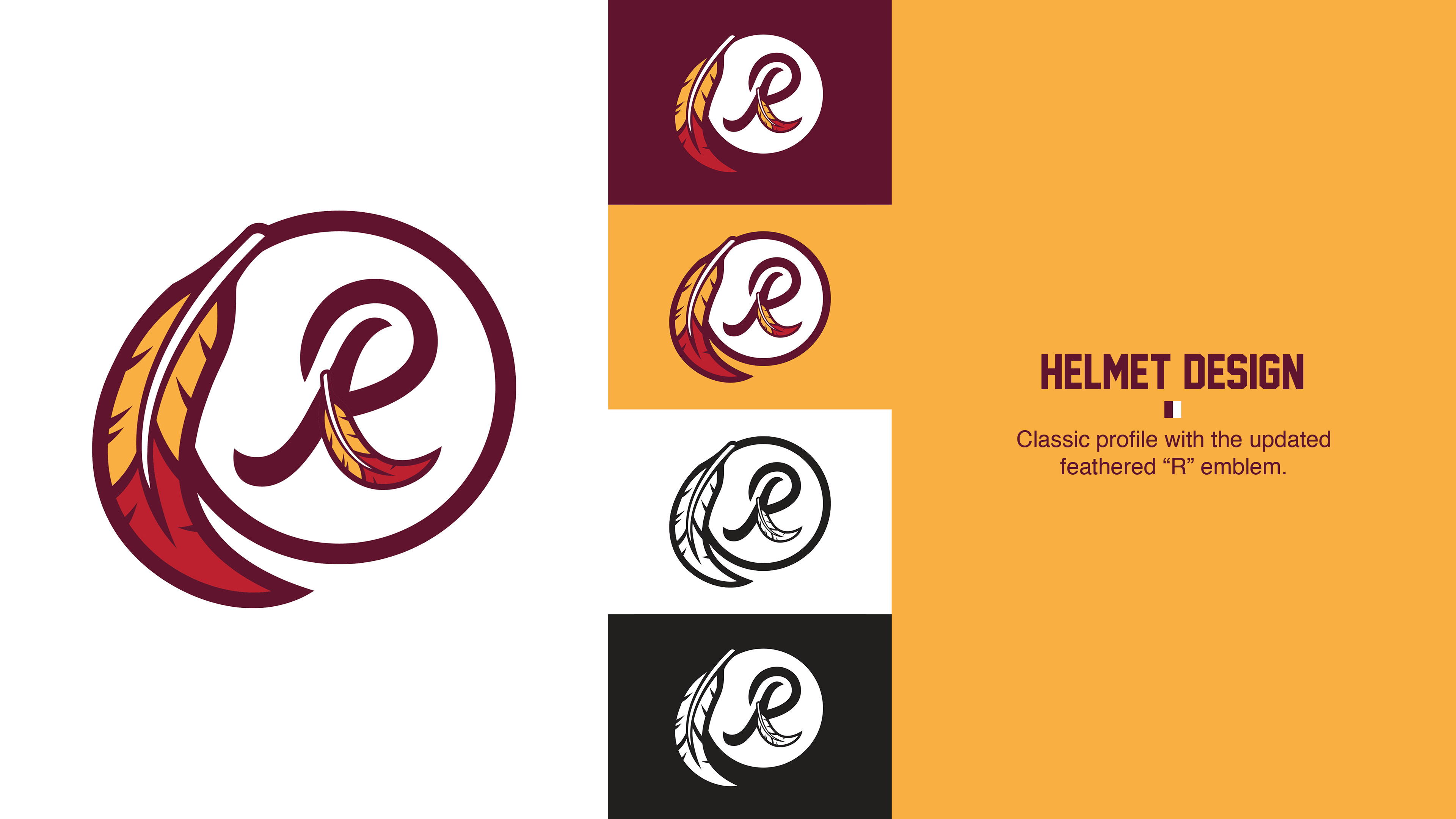
Helmet Design: Classic profile with the updated feathered "R" emblem.
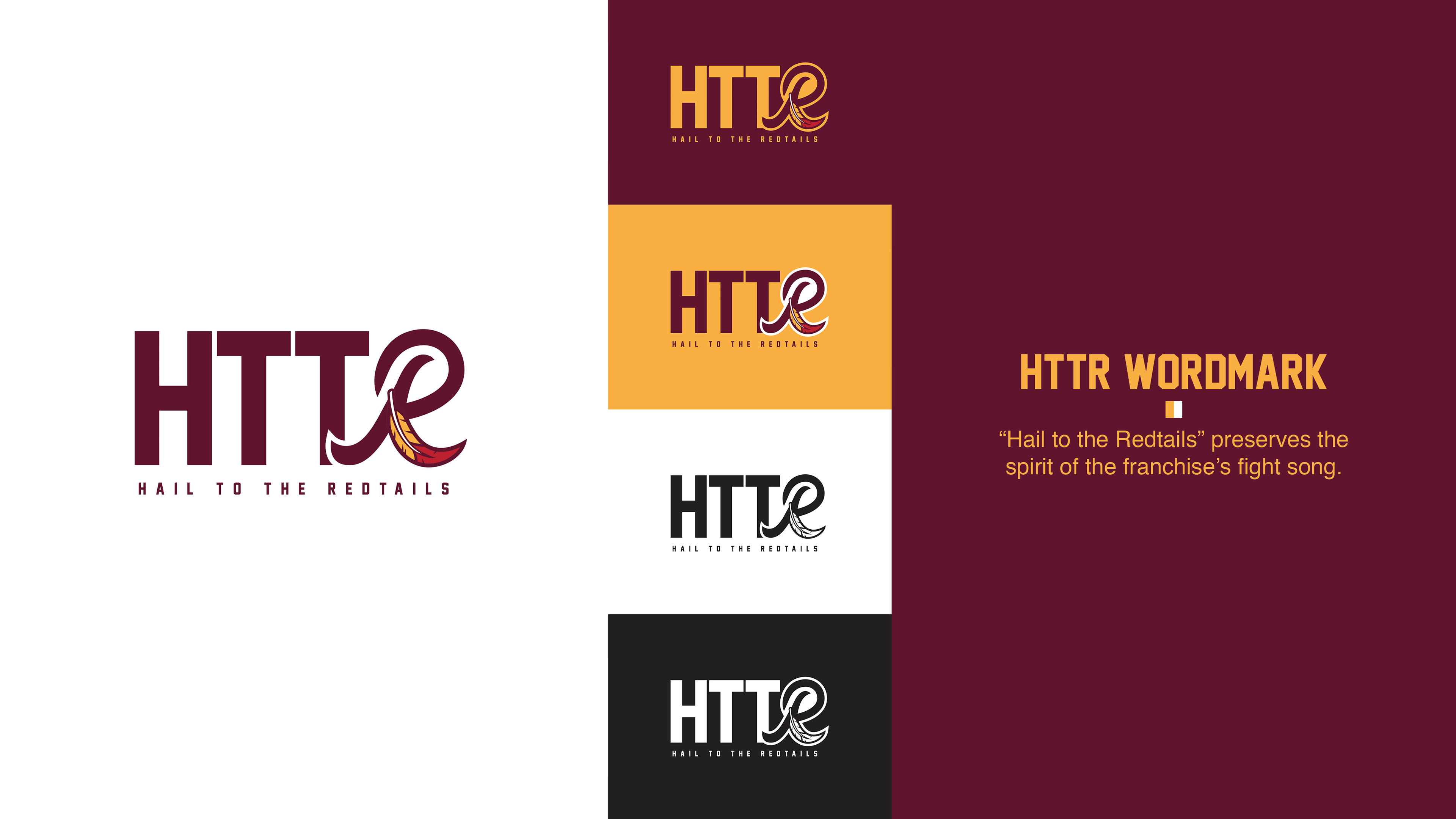
HTTR Wordmark: “Hail to the Redtails” preserves the spirit of the franchise’s fight song.
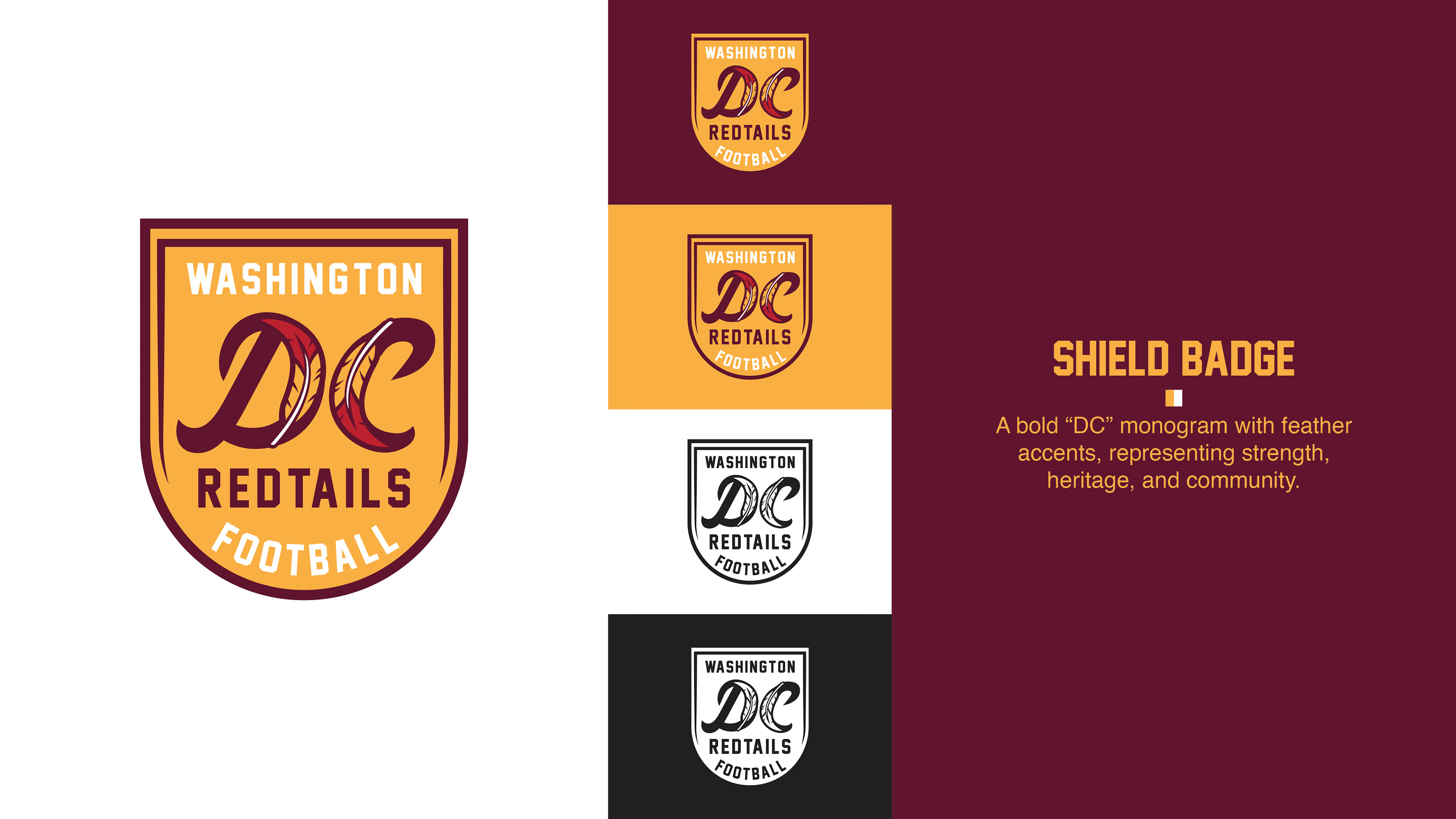
Shield Badge: A bold “DC” monogram with feather accents, representing strength, heritage, and community.
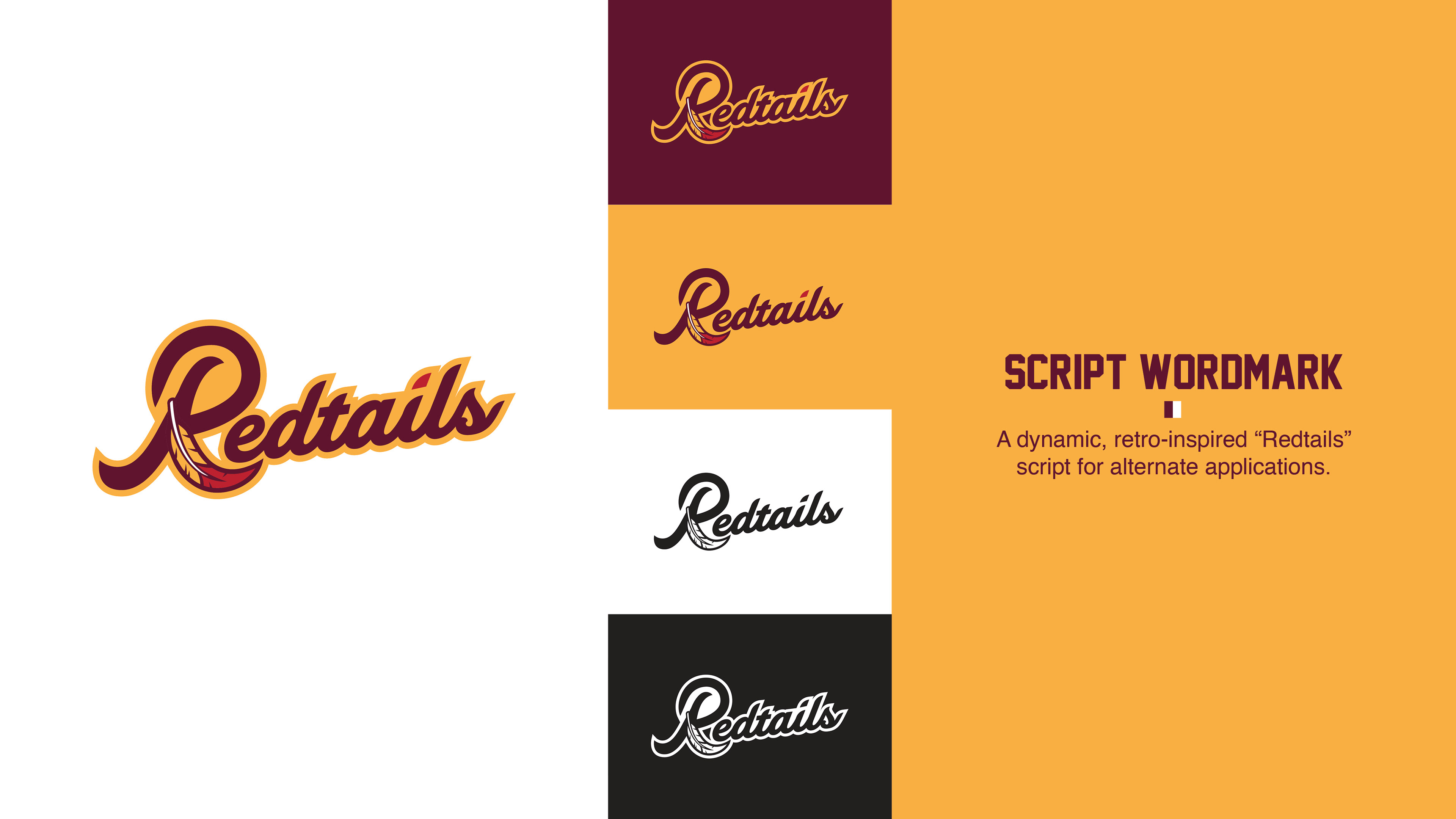
Script Wordmark: A dynamic, retro-inspired “Redtails” script for alternate applications.
This rebrand respects the team’s legacy while giving it a fresh, culturally thoughtful identity that honors the past, engages fans in the present, and sets the stage for a strong future.
Hail to the Redtails. HTTR.